


When you decide to renovate the house in which you live or enter a new one, it happens that within those parameters you envision new solutions, familiarising yourself with the space.
You try to let your imagination go and calmly try to see with your mind how to divide the space, how to make them practical, warm, comfortable, how to make them reflect the soul and life of those who live in that space.
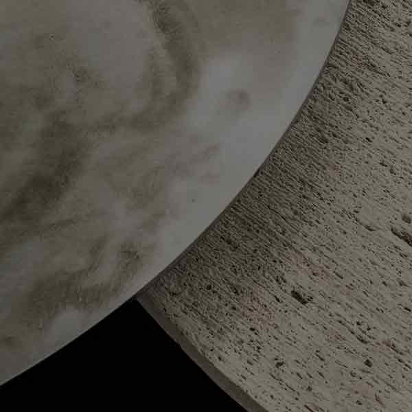
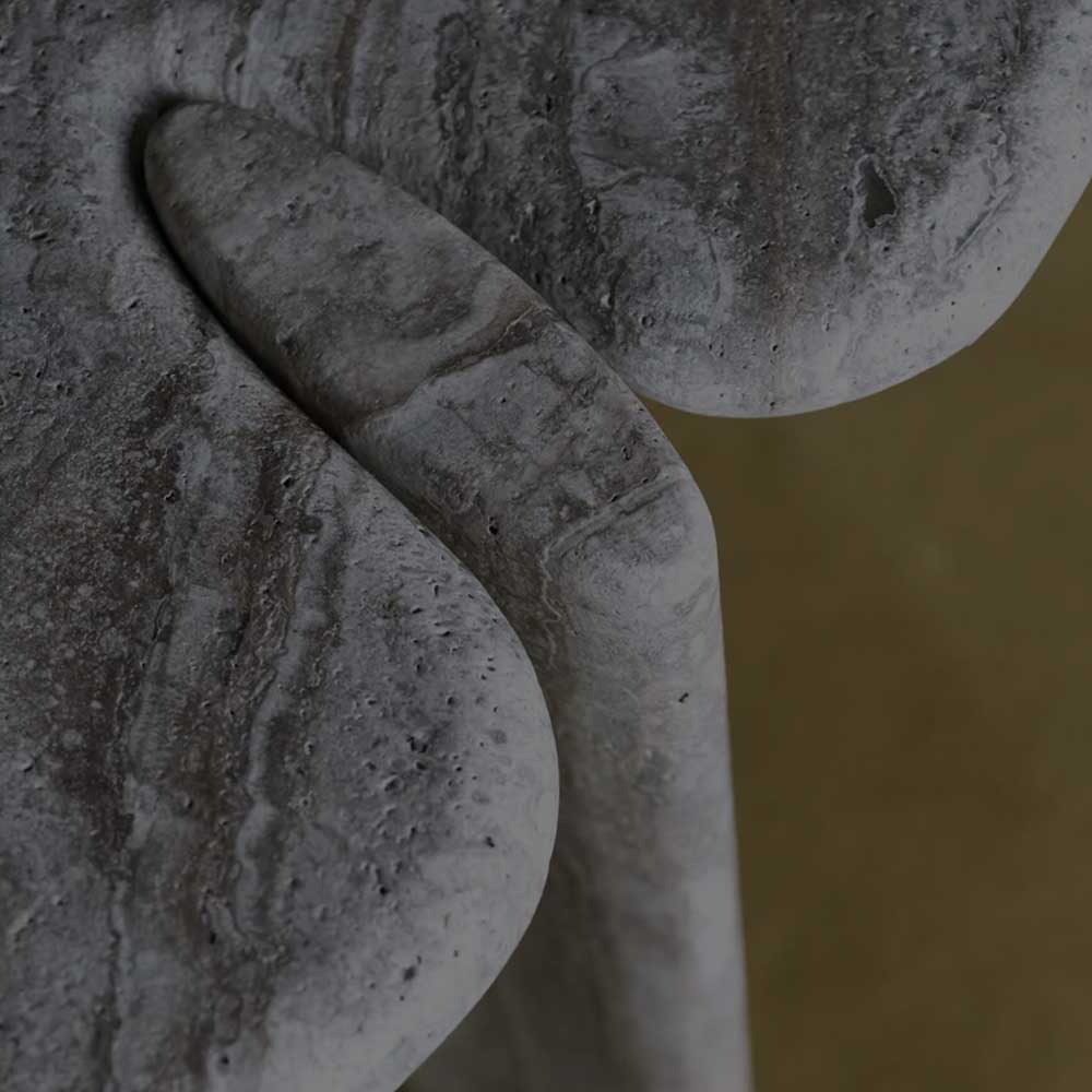
With your hand you caress the walls, doors, windows, there is still emptiness around but you begin to get in touch and create an exchange of energies.
Colour…, it is not easy to choose colours, perhaps it is one of the most difficult decisions to make when buying or renovating your home.
Do I want to be daring? or perhaps I’d want to avoid any risks, would I or would I not?
It can help to close your eyes and imagine being within those walls, thinking about what the furniture is if you already have it, or if it all starts from new, observing…. the room is bright or not, the ceilings are high or low the floor …
How many variables to determine this complicated choice.
In fact, when we talk about colour we are not only talking about walls but also about fabrics, furniture, accessories, carpets, curtains etc.
Furthermore, do we want to underestimate the psychological aspect? the importance that colours have on the psyche is of great importance.
There are relaxing colours that help to relax, then there are more vibrant colours that stimulate and make you more attentive and lively. In short, we try if possible, to put some order in this complicated world and if possible we try to give some suggestions and some advice that may enable a source of ideas.
Of great help and inspiration, even if trivial to say, it can be to examine multiple images of environments with different colours, just to understand where our personal taste goes and directs us.
The American company, Benjamin Moore born in 1883 in New Jersey, which in the field of colour offers technology and innovation, the paints are of high quality, the resins and dyes are produced within the company thus guaranteeing control on the product and performance with excellent application properties, but above all non-toxic and odorless paints.
Benjamin Moore launches a captivating initiative which consists of creating a new shade of colour that each year elects as the “Colour of the Year”, for example for 2020, has chosen a light and soft pink, a delicate colour but with great personality.
Once through a little research it has been understood which is the chromatic range that is closest to our personal taste, it is good to keep in mind that in an environment it would be better not to use more than three different shades to then decline in various shades more lighter and darker.
Here are some possibilities:
Tone on tone – the room can have different shades but all on the same and single tone to slightly liven up the environment
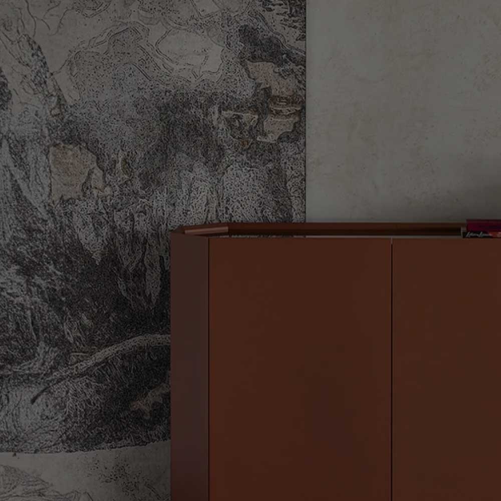
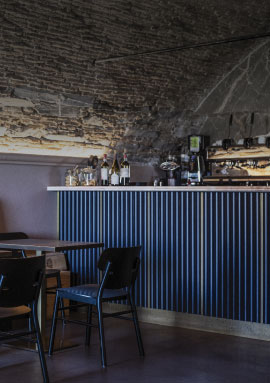
Complementary colours – if you love colour contrasts, you can choose pairs of complementary colours such as white and black, or blue and yellow, thus giving an imprint of great personality and creativity
Conformation of the environment – if the room is large but shallow, the walls can be painted in darker colours and tones than the floor and ceiling
To determine then, what is the chromatic trend to give to a room in general, it is good to keep in mind that in the living area you can use warm colours that are more energising while for the bedroom it would be better to use cold colours that are more relaxing.
In general, the bedroom, a place of rest and awakening, must contribute to the best of creating a real regeneration and helping to relax the body and mind also through colour, capable of creating a real chromotherapy and influencing the mood upon awakening.
Lets take the living room, which is the fulcrum of our home, the room that we live for several hours every day, the environment where we welcome our guests, will be the showcase of our way of being and the representation of our way of life, it is natural. Therefore, that particular attention is paid to this environment by choosing colours rich in personality.
Having said this and once established what are the bases of the shade chosen for the various rooms, we start with the combinations.
There is a very useful tool that helps to verify which are the combinations that are best which is called “Chromatic Circle”, obviously white, gray and black are part of those colours called neutral that do not create limitations in the chromatic choices.
You can create environments with the use of chiaroscuro, obtaining different shades with different intensities starting from one color, or you can combine warm colors with cold colors always using the chromatic circle that helps us to discover combinations that we had not weighed and would not have dared use.
The trend of the moment is to use contrasting colors, however, beyond the trends and fashions of the moment, it is always good to start from a base that is in tune with our taste.
As I have already said, a color is not just a color, it also has a psychological implication, which is why the combination and choice of colors becomes fundamental and must not be dictated only by fashions.
Another element to consider is the shape of the room if the ceiling is too high it is good to use a darker colour than that of the walls, on the contrary if the ceiling is too low it is good to use a lighter colour, if the room is small it is best to choose light colours.
To give a deep, narrow room a wider look, you need to paint the side walls a light colour and use a darker shade for the back wall.
On the contrary, if it is shallow, the walls must be painted with darker colours than the back wall of the ceiling and the floor.
If the room is small and dark, the ceiling must be the same colour as the floor and the walls must be lighter.
If there is an area that you want to enhance, it can be possible by choosing darker colours than the other walls, this way you get a contrasting break that highlights the chosen angle.
Finally, as already mentioned, it is necessary to consider the overall appearance and therefore the furnishings, the textiles and the objects, also in this case, attention must be paid to the colour combinations and, as always, to respect the colours as a whole.